Throughput Chart
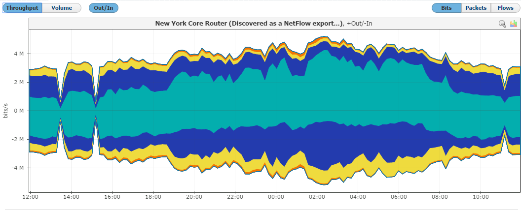
Throughput time chart enables you to see large number of parameters in an arbitrary time window. This is particularly suitable for viewing changes in the traffic over time, spotting traffic trends and anomalies:

On the graph, positive part of the y-axis shows outbound (Out) traffic, while negative part of the y-axis shows inbound (In) traffic. Out traffic is traffic originated from the internal network to external network, while In traffic is traffic destined to the internal network from external network.
Throughput Chart Types
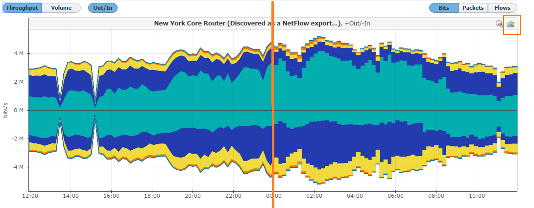
Throughput chart can be seen as stacked area or stacked column chart. Area chart enables you to see the flow of traffic more smoothly, while column chart gives you the ability to view traffic by each sample.
To switch between the stacked area and column chart click the chart icon. This will give you a chart as shown in the screenshot below. Re-selecting the chart icon will give you the original chart type back.

Throughput Side Charts
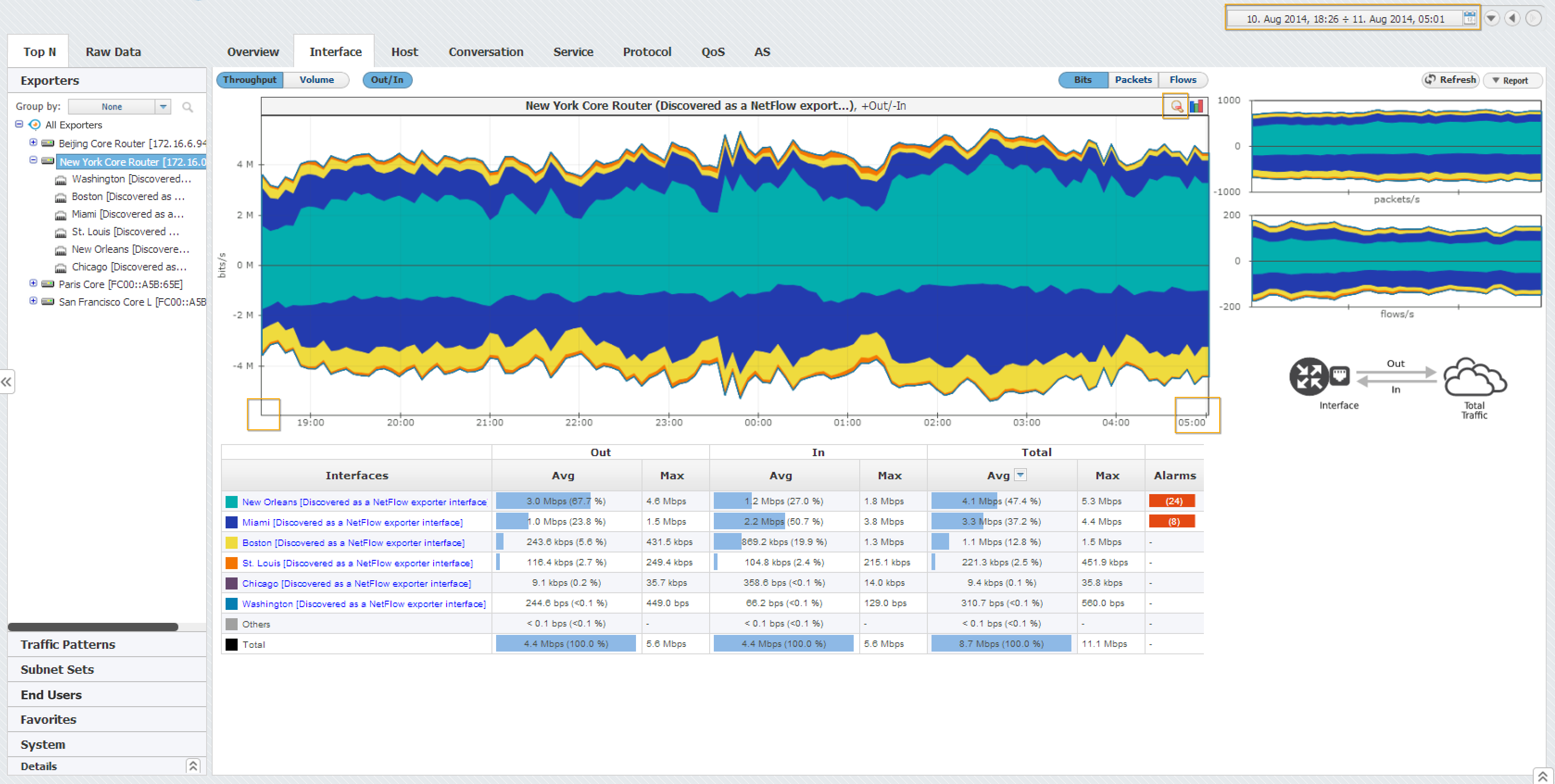
To the right of the main chart with selected measurement, you can see also two other measurements:

This view helps you to quickly compare the number of flows and/or packets with their size in bytes, enabling you to recognize attacks.
Throughput Chart Zooming
You can zoom in and out of the Throughput chart. This enables you to quickly and more directly select the time window you are interested in (in comparison to the time Time Window).
To zoom in:
- Move the cursor over the chart (cursor will turn from arrow to hand)
- Position the mouse to the beginning of the time window you are interested in
- Press and hold the left mouse button
- Drag the cursor to the end of the time window you are interested in
- Release mouse button

Chart and table are now showing the traffic for the time window you have just set.
