- Created by Anonymous, last modified by Vladimir Stanković on 24 08, 2016
Traffic is represented in several visual manners in order to provide you quick insight in the traffic structure:
- Throughput Chart (area and bar time chart) - time diagram, which represents one or more parameters within the selected time frame allowing you to follow changes in traffic and recognize traffic trends with ease.
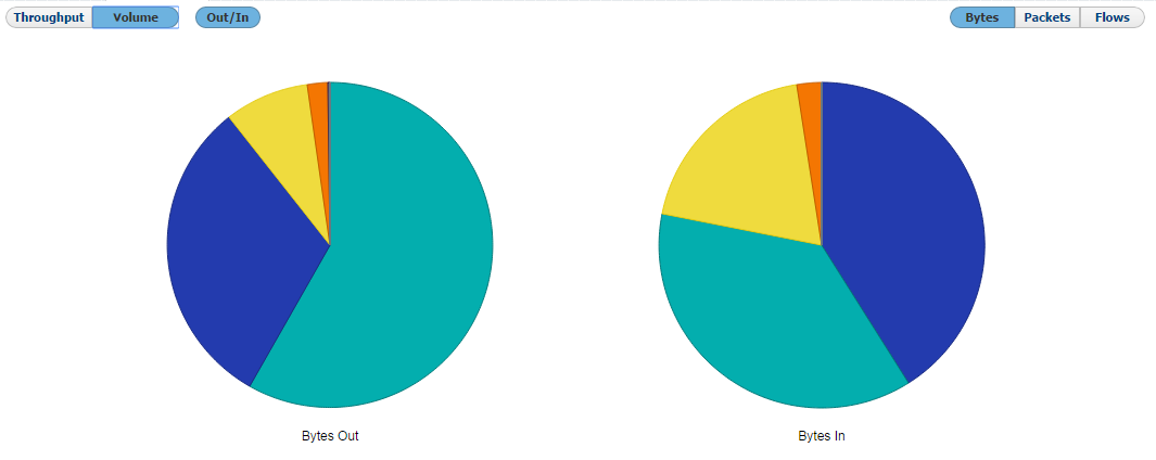
- Volume Chart (pie chart) - distribution of Top N bandwidth consumers in a pie chart form, allowing you to easily visualize and compare bandwidth consumers with each other.
- Table (text table) - in addition, Throughput and Volume charts are followed below by a corresponding top-talker table. Top-talker table shows entities most contributing to the traffic showed on Throughput and Volume charts.
Charts and tables are network element and time specific. In other words, each chart and table shows traffic for a selected node in the Navigation tree for the given TIme Window.
Throughput Chart
Throughput is a time chart enabling you to see large number of parameters in an arbitrary time interval (set by Time Window). This is particularly suitable for viewing changes in the traffic over time, spotting traffic trends and anomalies:
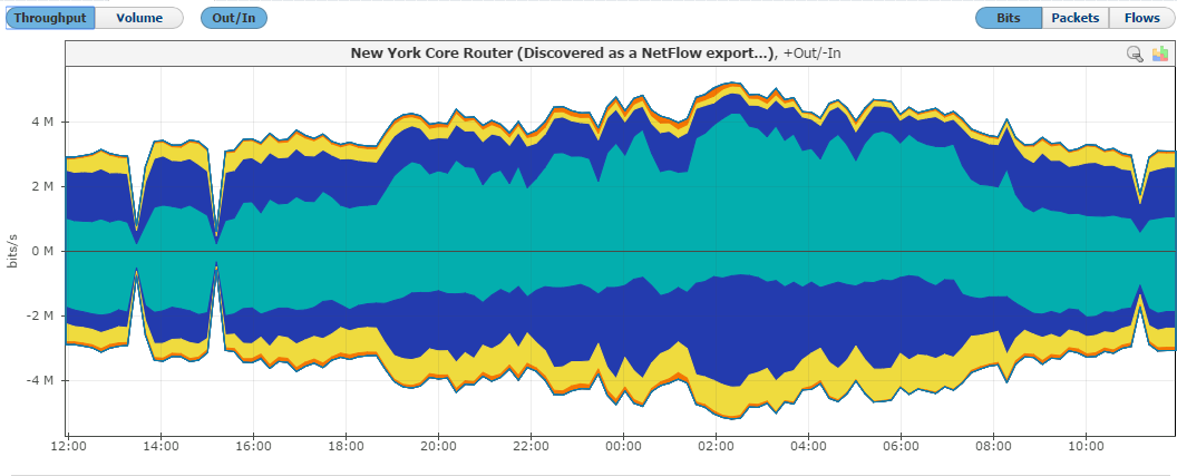
On the graph, positive part of the y-axis shows outbound (Out) traffic, while negative part of the y-axis shows inbound (In) traffic. Out traffic is traffic originated from the internal network to external network, while In traffic is traffic destined to the internal network from external network.
The Top-talker table below will show average and maximum values for In and Out traffic achieved during the given time interval, as well as Total traffic in the selected measurement unit (bps, pps, fps) and as percentage of total traffic for each table entry.
View Options
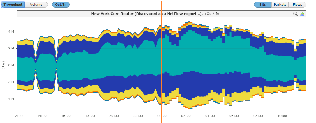
Throughput chart can be seen as area or bar chart. Area chart enables you to see the flow of traffic more smoothly, while bar chart gives you the ability to view traffic by each sample. Use the area chart for spotting trends and over-viewing the traffic of large time intervals. Use the bar chart when solving problems and when you need more details on the sample level (time interval you are inspecting is relatively small).
To switch between the area and bar chart click the Area chart or Bar chart button. This will give you a chart as shown in screenshot below. Re-selecting the option will give you the original view back.
Zooming
You can zoom in and out of the Throughput chart. This enables you to quickly and more directly select the time window you are interested in (in comparison to the time Time Window).
To zoom in:
- Move the cursor over the chart (cursor will turn from arrow to hand).
- Position the mouse to the beginning of the time interval you are interested in.
- Press and hold the left mouse button.
- Drag the cursor to the end of the time interval you are interested in
- Release mouse button
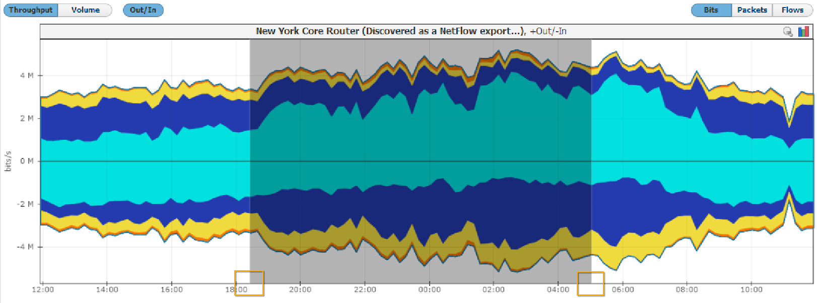
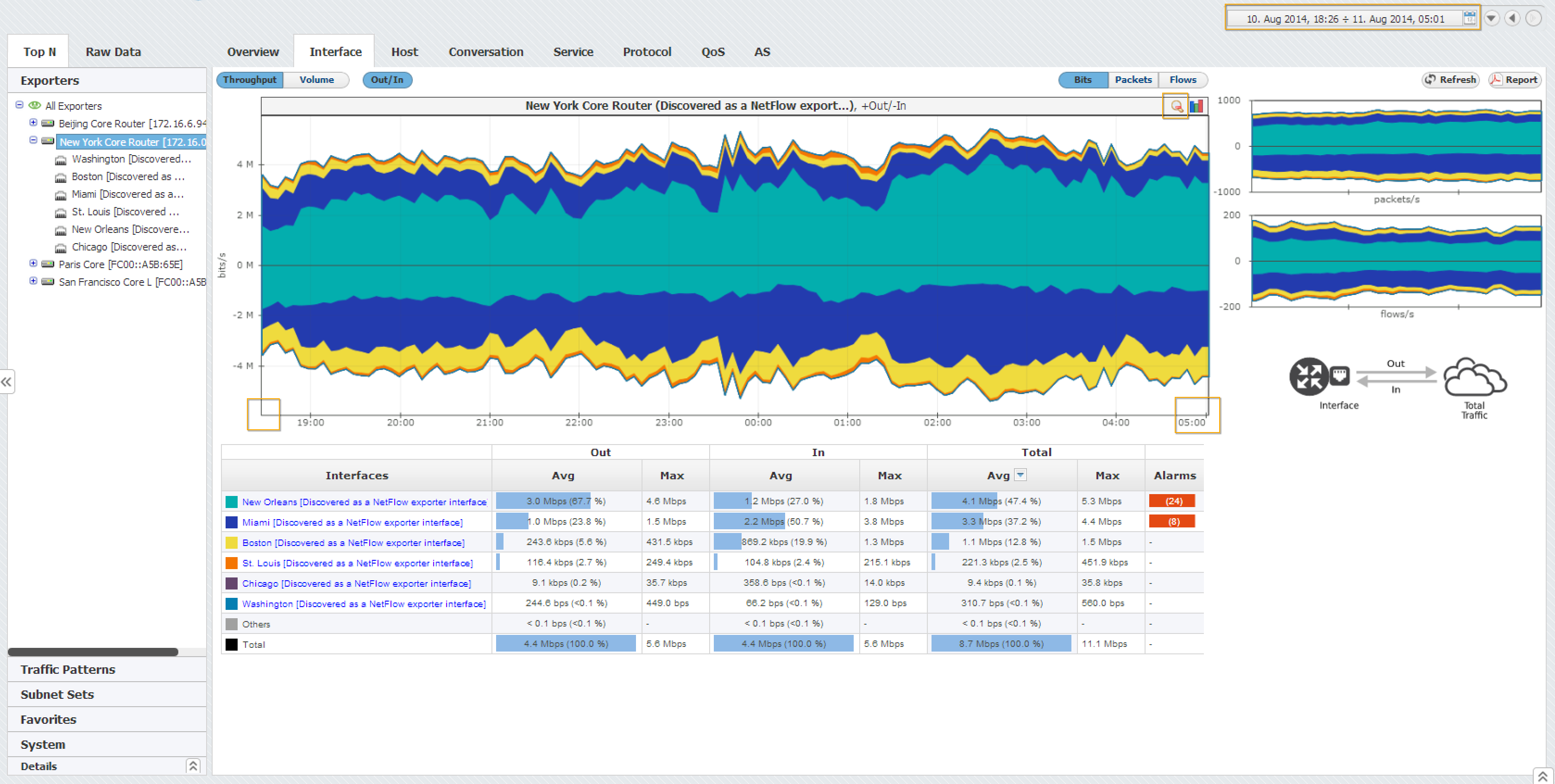
Chart and table are now showing the traffic for the interval you have just set.
Volume Chart
Volume is a pie chart enabling you to easily visualize top-talkers in regard to total traffic and each other, for the given Time Window.
There are two charts, for inbound (In) and outbound (Out) traffic.
Table
Text table shows average, maximum and total values for top-talker contributes. Additional columns, such as In, Out, Src or Dst, will show if applicable.

Table can be sorted by any column in decreasing or increasing order. Selecting the column again will switch between decreasing, increasing and no ordering. Table also shows if there were any alarms during the selected Time Window for all top-talkers.
"Others" entry in the charts and table (in gray) represents traffic not belonging to top-talkers. Only exception to this is the display of Subnets where “Others” entry represents all values that are matched to a traffic but not matched with any defined subnet for that traffic.
IP Address Resolution
To completely understand host, conversation and AS traffic it is necessary to have background knowledge about the host IP addresses that participated. However, this may prove time consuming and network admins often don't have time to browse manually for this information online.
For this reason, NetVizura provides IP address resolution (Hostname, Geo-location and Whois information) that significantly saves time, improves readability of the statistics and increases overall contextual awareness.
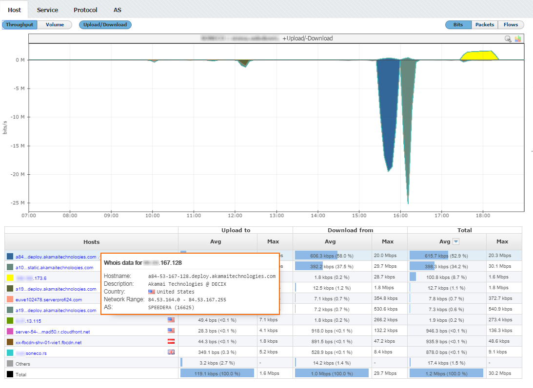
As you can see in the screenshot above, this end user had two bigger downloads at around 16h from two IP Addresses belonging organization Akamai Technologies, located in United States.
Additional Options
Set Metrics
As a measurement unit for the observed traffic, the charts and table can show:
- Bits - bits per second (bits/s, bps)
- Packets - packets per second (packet/s, pps) and
- Flows - flows per second (flow/s, fps)
Side Charts
To the right of the main chart with selected measurement, you can see also two other measurements:

This view helps you to quickly compare the number of flows and/or packets with their size in bytes, enabling you to recognize attacks.
Top Talker Isolation
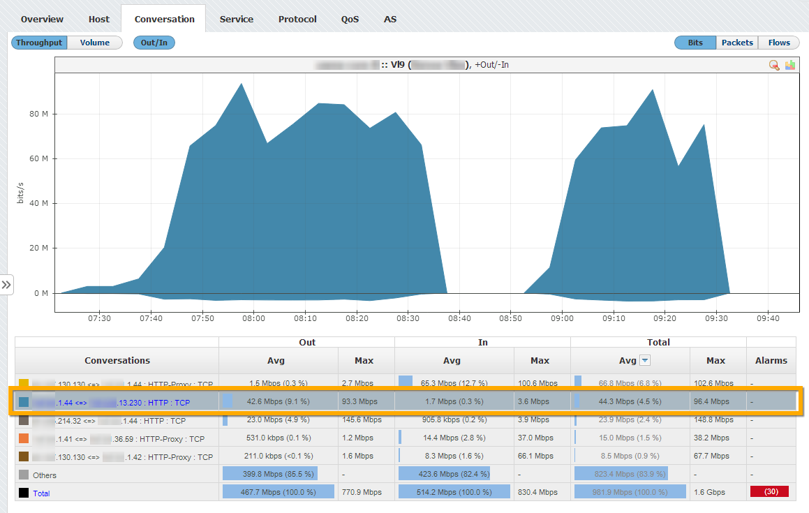
You can isolate contribution of any top talker by clicking on the top talker name in the table. This will reload the chart to show the contribution of the selected top talker only.
To change the number of top-talkers shown in the charts and tables, read more about TopN Settings.
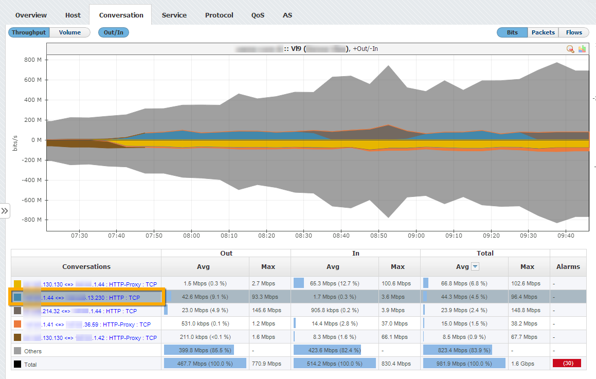
In the example above you can see top conversations. If you click on the second conversation A.B.1.44 => C.D.13.230 : HTTP : TCP, chart will reload to show the selected conversation traffic only (screenshot below).
To cancel the top talker isolation, click on the top talker name again.
Top Talker Drill-Down
If a top talker is an exporter, interface, Subnet or Subnet Set, clicking on the its name will result in the jump to that top talker in the Node Tree rather then the top talker isolation. The jump occurs because more detailed traffic for that top talker is available by jumping to its node then by simply isolating it on the chart.
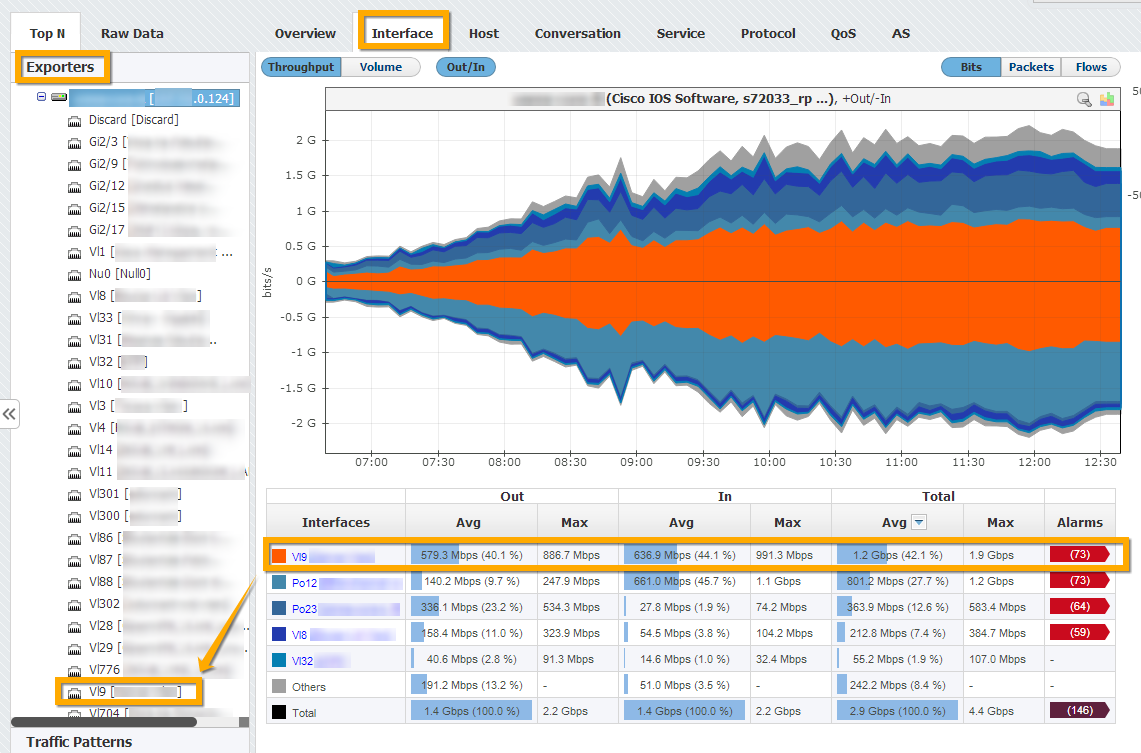
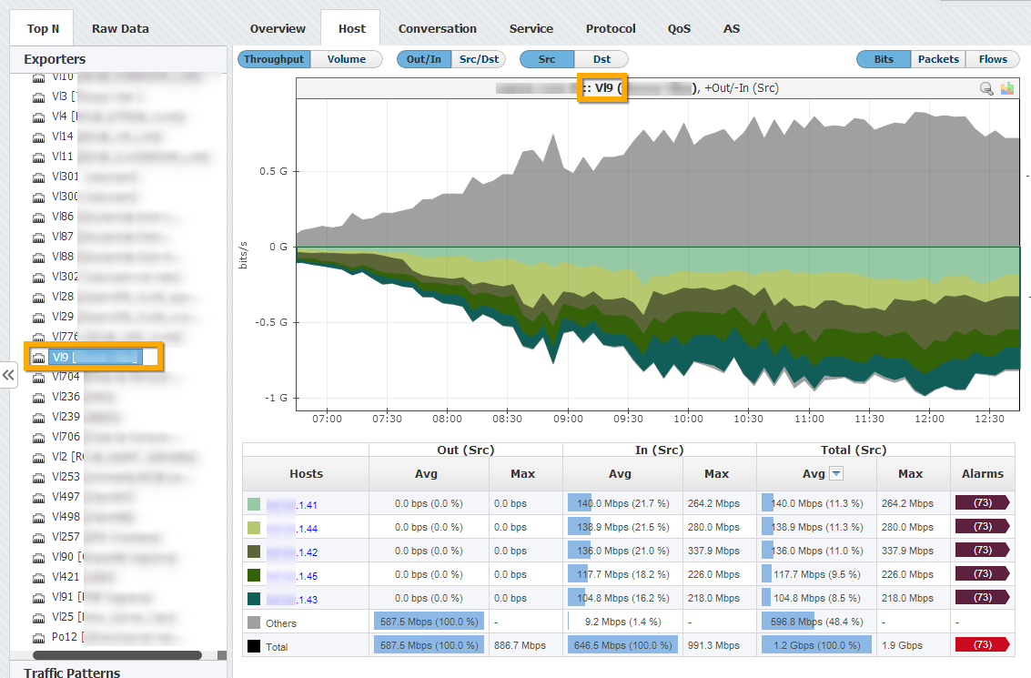
In the example above (first screenshot) you can see top interfaces of an exporter. If you click on the first interface Vl9, you will jump to that interface to view its traffic in more details (second screenshot above).
Top Talker Highlight
To highlight a top talker on the chart or table, simply click on it in the chart or on its table cell in the table. Chart field and table row will become highlighted:
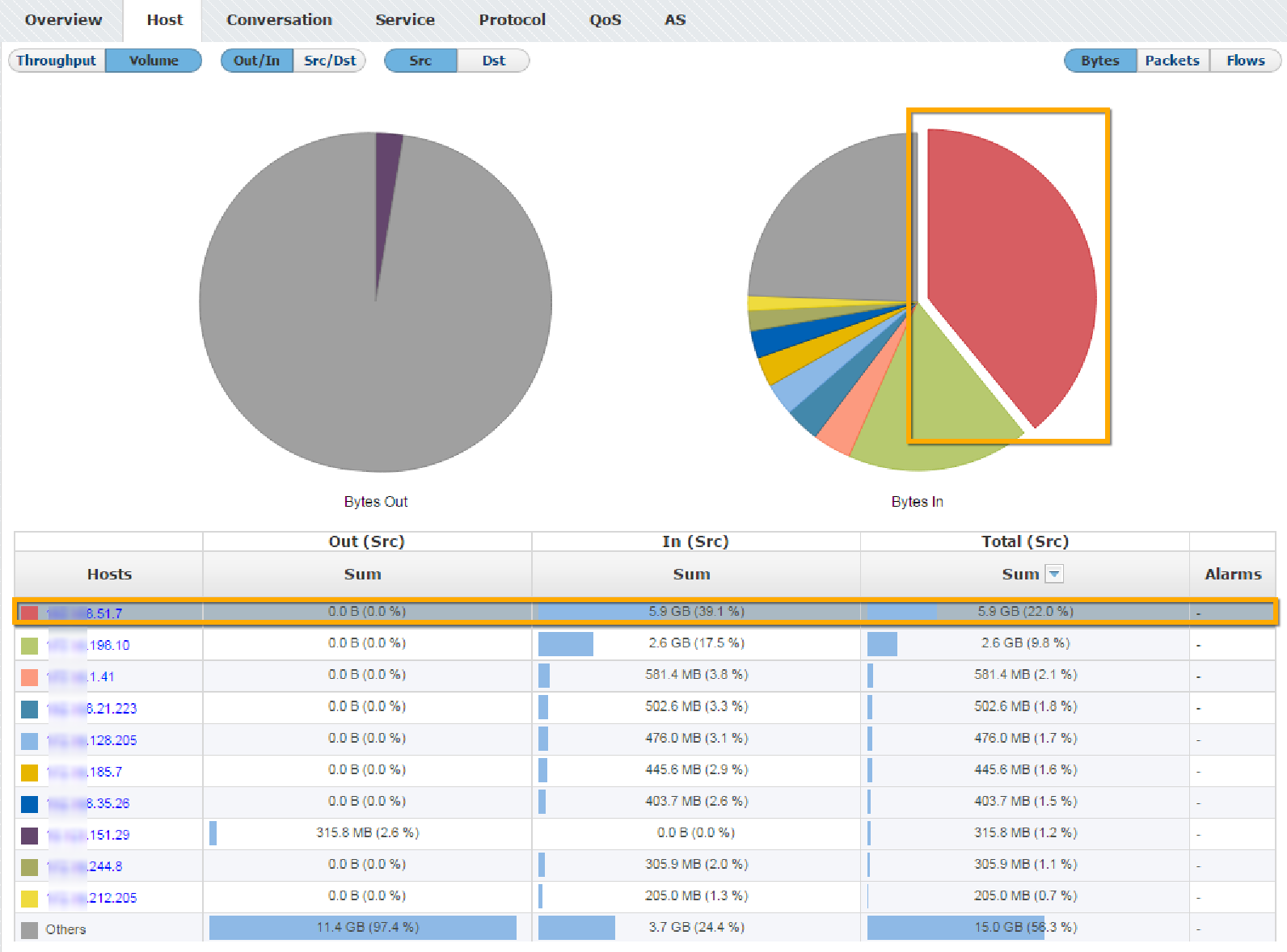
This can be very useful if colors on the chart are similar.
- No labels